PIEZOGRAPHY WARM NEUTRAL INK
BY JON CONE
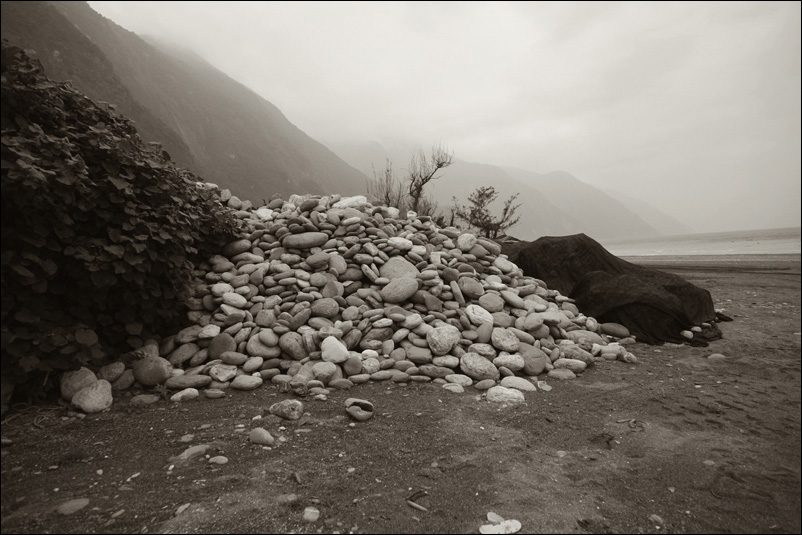
Soft proof: Warm Neutral K7 Glossy on JonCone Studio Type 5
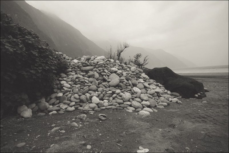
Soft proof: Warm Neutral K7 on JonCone Studio Type 2
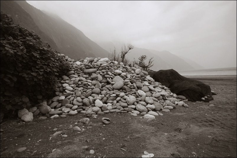
Soft proof: Warm Neutral K7 Glossy on Epson Exhibition Fiber
Piezography inks are available in five specific monochromatic tones. Piezography Warm Neutral is our most recent Piezography tone. It is reminiscent of PiezoTone Warm Neutral. The major difference is that PiezoTone inks were available only in four shades, whereas Piezography Warm Neutral is available in seven shades. And Piezography inks are encapsulated pigment, whereas PiezoTone inks were non-encapsulation. Encapsulation is a method in which each tiny pigment particle is encased in a micro layer of acrylic co-polymer. This virtually eliminates head clogging.
Piezography Warm Neutral in some ways is the “original Coca Cola” of Piezography. When we first introduced Piezography in 2000, we introduced it with a Warm Neutral ink. Later we vastly improved our ink chemistry and introduced PiezoTone Warm Neutral in 2002.
The best way to describe Warm Neutral is that of a warm photographic gray similar to the bromide or slightly azo greenish surfaces of yesteryear. It is actually one of my most favorite tones. I suppose I like all my inks. But, this is the ink color that I first introduced and I find myself coming back to it time and time again. I especially favor it for small prints. I think the soft warm tone is perfect for images which are intimate in size. The tone does not try to grab attention by being too warm or too cold. I think Warm Neutral allows the strength of the photograph to come through in a way that is very familiar. It is a visual neutrality that is different than printing with Piezography Neutral.
Warm Neutral inks produce a black and white tone that is simply a very natural photographic color; one that will be familiar to just about anyone who used to do darkroom work.
I produced some soft proof images of the actual inks on paper with reference to both the ink black (actual measurement of the reflected black density) and paper white (the actual color of the paper). These soft proofs should look a lot lighter in the shadows than the black of your display. Your display has a dynamic range of about 4.0. Matte paper has a dynamic range of about 1.8. Soft proofs attempt to display the dynamic range onto a monitor. Of course the glossy soft proofs have significantly higher dMax.
To the left you see warm neutral ink on three different papers. JonCone Studio Type 2 is a non-OBA fine art smooth matte paper. Epson Exhibition Fiber and JonCone Studio Type 5 are both baryta style papers which were printed with Warm Neutral glossy.


