Much further down this page is an opinion written in 2012. This page is now updated in 2024… You can read further down the page the State of the Arts in 2012. It is much different than this opinion dated April, 2024.
Piezography Post Trump.
(An opinion written April, 2024) Strange name for an opinion piece to be sure. However, when the Trump Administration dismantled the Consumer Financial Protection Bureau it was an effort to stop the prosecutions being levied against financial institutions. However, the department was also responsible for a wide range of consumer protections. For example, it enforced the rights of US citizens to receive warranty repairs as well as to choose their own consumables. And while the Biden Administration has been restaffing it, and the staff rebuilding it, it may take a decade for it to again have an infrastructure that protects ordinary US consumers.
Currently, European and Chinese photographers can purchase EPSON printers in their regions of the world that have been manufactured in such a way that it is possible for them to choose their own consumables (inks) and most of these creatives are able to use a chip resetter in the same way USA creatives were able in 2000s, 2010’s when an ink cartridge could be re-used, or its chip harvested to apply to a refillable cartridge, or refillable cartridge could be used and its chip reset when the cartridge was empty – and refilled.
This is no longer possible with printers that are now for sale in the USA. Canon, EPSON, and HP are designing and building their printers for the USA market differently than how they do for Europe and China regions. The USA market also controls how printers are built and designed for Canada, Mexico, Central and South America. New printers cannot be operated without the actual OEM ink cartridge and the printer designed in such as way as to prevent the resetting of chips or the reuse of any chip. And because there is no enforcement of long-standing USA laws that protect consumers it is entirely possible that the “smart-chips” long used to thwart consumers (by making it more difficult) may fall to the wayside in favor of less-expensive-but-more-severe anti-choice measures that can be employed. Smart-chips have become much more expensive now that the world-wide demand on AI (artificial intelligence) chips is greater than the supply.
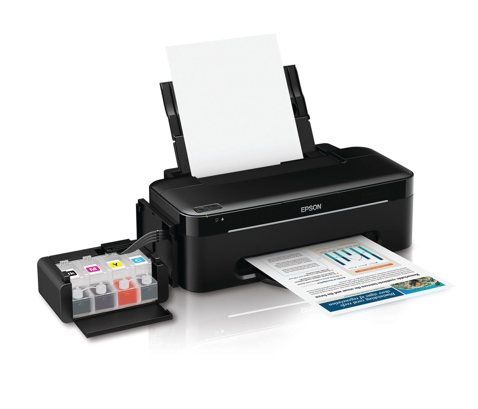
Currently, in the USA, you cannot purchase a new printer in which you can use Piezography inks. However, you can in Europe region and in China region. One example is the SureColor P900 (sold in EU) and the SureColor P908 (sold in China region). These printers can be used with a simple chip resetter that resets the EPSON chip. Those chips can be harvested from the EPSON ink cartridges and applied to refillable ink cartridges. However, the USA regional P900 printer cannot recognize chips from EU and China regional, and the USA printer is designed so that the EPSON chips cannot be reset, and 3rd party chips cannot be used. Those three “cannots” prevent choice of inks in the USA.
Because EPSON is no longer providing warranty service in the USA for use of a choice of consumables that are different than what EPSON supplies, it does remove a deterrent to importing a printer from Europe or China. These printer warranties are not available to USA users. Importing a P900 from Amazon in Europe is a solution for those wanting to print Piezography with the purchase of a new printer. InkjetMall will be selling a European EPSON P900 chip resetter and European style refillable ink cartridges for those who import their non-USA region printer from the EU.
For the rest of you – who are looking for a solution the pickings are slim to none in terms of a new purchase. However, there are retailers here and there with old P800 inventory. Many vigilant photo studios have purchased spare printers and these remain unboxed and often found on Craigslist and eBay. My own studio has enough unboxed EPSON printers to last a decade or more. But this has been its practice since the smart chip was first introduced.
Probably the best solution right now is the preponderance of SureColor P7000 and P9000 printers that have a tendency to clog with the use of EPSON inks. When a color printer loses a single channel it can no longer be used to print color. Its owner faces a multi-thousand dollar repair or it is in many cases going to be pushed to the corner and a new printer purchased. Most communities in the USA make it difficult for a consumer to “trash” a large electronic printer. These are the printers that are ripe for acquiring often for free Although in which case “free” may mean carrying down two flights of stairs and loading it yourself into the back of a SUV.
USED Printer Strategies
The P7000 and P9000 have 10 ink channels used by 11 ink positions. The MK and PK share the same ink channel and are switched in the ink selector unit above the print head.
- If there is a loss of a single ink channel the printer can be used perfectly for Piezography Pro inks (the 9 ink edition).
- If there is a loss of two ink channels and neither one if black, the printer can be used perfectly for Piezography Pro inks (the 9 ink edition).
- If there is a loss of only the black ink channel, the printer can be used perfectly for Piezography Pro inks (the 9 ink edition).
- If there is a loss of two ink channels and one of them is either MK or PK (but not both) the printer can be used perfectly for Piezography Pro inks (the 9 ink edition).
- If there are only 8 working ink channels, the printer can be used perfectly for Gloss Only Piezography Pro (and also digital negatives).
- If there are only7 working ink channels, the printer can be used perfectly for Matte Only Piezography.
- If there are only 6 working ink channels, the printer can be used perfectly for digital negatives.
- If there are only 3 working ink channels, the printer can be used perfectly for 3-ink version of direct-to-plate photopolymer photogravure.
- If there is only 1 working ink channels, the printer can be used perfectly for 1-ink version of direct-to-plate photopolymer photogravure.
The P6000 and P8000 have 8 ink channels used by 9 ink positions. The MK and PK share the same ink channel and are switched in the ink selector unit above the print head. The 9 ink edition of Piezography Pro was designed for these two printer models.
- If there is a loss of a single ink channel that does not include black, the printer can be used perfectly for matte only or gloss only printing (but not both). If gloss only it can include digital negatives.
- If there are only7 working ink channels, the printer can be used perfectly for Matte Only Piezography.
- If there are only 6 working ink channels, the printer can be used perfectly for digital negatives.
- If there are only 3 working ink channels, the printer can be used perfectly for 3-ink version of direct-to-plate photopolymer photogravure.
- If there is only 1 working ink channels, the printer can be used perfectly for 1-ink version of direct-to-plate photopolymer photogravure.
Because the 3880, P800, Pro 7890 and 9890 follow the ink scheme of the SureColor P6000, P8000 the same logic applies as it does to those models.
Because the Pro 7900 and 9900 follow the ink scheme of the SureColor P7000, P9000 the same logic applies as it does to those models.
Piezography inks in comparison to EPSON inks are much easier on print heads and relatively maintenance free in comparison. One thing you should not consider is leaving a chipped, but empty cartridge in a print channel that is not functioning. That can affect the channels adjacent to it. Always keep ink or better yet, PiezoFlush in the unused ink channels.
We do not expect there to be solutions for USA sold new printers in the future. One of the reasons for this as we have been told is that a settlement has been reached that prevents the main semi-conductor company of supplying 3rd party chips into the USA market. A second reason is that semi-conductor companies have no interest in making investments into designing chips to circumvent OEM anti-3rd party chip schemes because investments are better off spent in the more lucrative and higher demand AI chip production. Finally, the reduction in use of printers designed for photographic and fine art printing has caused this market to no longer be lucrative to 3rd party chip manufacturers as it was in the 2000s and 2010s. Today the majority of photographers and fine artists are “printing” their images to social media and websites. The need to actually physically print their work is not a requirement today for masses of people to see the work. The market for “prints” is now also equally deflated. The market for ink for the OEMs in the photo and fine art markets is a fraction of what it is in other new sectors now. The perfect storm so to speak for an inkjet creative.
We are living in the age where inkjet is quickly becoming an alternative medium and the availability of inkjet printers in the future is not a certainty for anyone. That lays solely in the hands of corporate decisions makers based on profits from a market now driven by social media. Time will tell. For those who love printmaking – it is always a good time to seek out ways in which to be creative and to explore.
STATE OF THE ARTS
An opinion by Jon Cone based upon the article of the same name published in the Jan/Feb 2012 issue of View Camera Magazine.
In 2002, Epson introduced their first improvement to black & white printing when they added a light black ink in the then new Epson 2200 desktop printer. It would take Epson nearly five more years before they would deliver two shades of light black ink in the R2400 desktop printer. Epson considered the Ultrachrome K3 inkset to represent “a turning point in the history of inkjet printing.” With three unique levels of black, Epson claimed that the new Ultrachrome K3 color inkset “dramatically improves both color and black & white prints.”
The two light shades of black did dramatically improve Epson Ultrachrome K3 prints, but only in comparison to earlier Epson Ultrachrome prints. Over the same time span and even several years earlier, specialized black & white inksets flourished. Piezography® transformed from a quad-black (four shades black) inkset in 2000 to a septone (seven shades of black) inkset in 2005.

Ink density equivalents between Piezography K7 and Epson K3 inks
Piezography inks are replacement inksets for Epson color printers. First released in 2000 for the Epson 3000 printer, their background goes back even further to the ConeTech $150,000 quad-black inkjet system developed in 1995 for IRIS Graphics 3047 large format inkjet printers. The OEMs have been extremely slow to adapt black & white and still none has made a purpose built system expressly for black & white photographers.
Even today, the Ultrachrome HDR inks and Epson’s ABW (Advanced Black & white) system on a $5,000 Epson 9900 printer cannot produce the same fidelity nor the fade resistance of a $200 Epson Stylus Photo 1400 printer outfitted with Piezography Carbon K6 inks. But, Epson is not alone. Canon and HP have both put forth ink sets that include shades of black ink, but are designed more so for printing color.
In the OEM world, black & white still represents a compromise. The online and tradeshow evangelists for these three companies routinely espouse their black & white superiority over the other. But, none of these systems has yet reached the standard of a finely crafted darkroom silver fiber print. Yet, all around the world and for well more than a decade, many photographers have routinely been printing with customized and specialized black & white inkjet solutions that raise the bar significantly over the OEMs.
Highly specialized black & white inkjet systems have evolved to a point that they are now often highly personalized involving hybrid combinations of materials, technology, and skills.
DeanImaging in Atlanta, GA is one of the few studios in the country where one can have their black & white photographs printed for side-by-side comparisons on the Canon IPF8300, the HP Z3100, and a Piezography powered Epson 9890. DeanImaging is owned and operated by photographer/artist John Dean who prints for clients across the USA. “If you are doing this stuff commercially and you have a variety of projects to do and you have to get them done fast different printers have different aspects to them”, said Dean.
Dean uses the HP Z3100 printer for its amazing dMax, well documented exceptional longevity for both color and clean neutral or toned black & white, and it’s ease of profiling for alternative media. Dean’s new Canon IPF 8300 when used with the non-OEM BowHaus True Black & white rip, is great for making fast, totally smooth, totally neutral, warm, or toned monochrome prints with the Harmon Baryta media. “I have matched many silver prints with this combination, much to my surprise,” said Dean.
For his personal work, Dean is one of the first photographers in the world to install the Piezography Carbon K7 inkset into the new Epson 9890 44” printer which Dean says has the best resolution and speed of any printer he’s used. His photographs are taken with a 4×5 view camera on Tmax 100 film, and then scanned on an Aztek drum scanner with very good software. Dean uses the QuadTone RIP by Roy Harrington to print K7 inks to the Epson 9890 and uses the InkjetMall provided generic media profiles as well as had custom K7 curves produced by InkjetMall.
“There is a term that printmakers use to describe a point at which a particular combination of inks, media, and workflow come together to complement each other to make the art look they way you dreamed it could look. That is what we call its “sweet spot”. Dean, an accomplished guitarist added, “It’s kind of like when a guitarist finds the perfect set of strings on the perfect instrument with the perfect amp and the perfect tone settings. It’s like Santana says, then your fingers start making music automatically, the way you hear it in your head. Sometimes is not easy to determine what isn’t perfect, or why something is almost right though not quite there, but when something happens that is perfect for you, you know it.”
“When it gets down to that sweet spot for my own work, something that rises above the everyday work, I like Canson Rag Photogaphique or Edition Etching papers with the Piezography K7 Carbon inks. When I lay proofs down beside each other of all these inks on all these fine papers, glossy and matte, clearly the most elegant one and the one having the most authority is the Piezography K7 on the Canson papers. The K7 inks blow them all away,” said Dean.

John Dean, Tsunami Village, 16×20, Split Quadtone from Warm-Neutral K7 and Selenium K7
“Even from 20 feet away you feel like you can reach out and grab the objects in the print. The values from middle gray to super light gray have more dimension. That is the difference. That is what separates K7 from the really nice HP quad print with Vivera inks, or the quite subtle, bronzing-free tri-tone black & white gloss print on my Canon IPF8300. It’s a matter of being able to feel the sculptural volumes of the subjects I photograph and the still life set-ups I make. With the K7 there is no hint of film grain or no hit of digital noise. I’d like to see a silver print pull that off. It’s not possible, but it is possible with K7” said Dean.
When comparing the current print head technologies, Canon, Epson and HP printers designed for photographic printing all have very similar capabilities. The Canon and HP printers have made paper-handling improvements that now rival Epson. But, it is Epson that has historically manufactured their printers in such a way that makes it easy for its customers to use third party alternative inksets. I first began developing ink in 1998 for the Epson 3000 printer and empty cartridges were readily available. Today an enormous industry exists that produces high quality refillable cartridges and CISS (continuous ink supply systems) for Epson printers.
As a result an enormous range of alternative specialty inksets are available for Epson printers that include dye sublimation, eco-solvent, edible, invisible, numerous dye & pigment replacement inks, and most importantly a bevy of monochromatic ink choices. Where there are lots of ink choices, printer RIPs and specialty software usually follow. The Epson printer remains the only printer platform that is so easily customized and so well supported by third party companies.
But, many consumers still erroneously believe that using a different choice of ink, or using refillable cartridges, or a third party printer driver will void the manufacturer’s warranty. Often the manufacturer plays to this fear by using verbiage that states that “the use of these may void the warranty”. The keyword is may. The reality is quite different.
Legally, the Magnuson-Moss Warranty Act is a Federal consumer protection law that states that: “No warrantor of a consumer product may condition his written or implied warranty of such product on the consumer’s using, in connection with such product, any article or service (other than article or service provided without charge under the terms of the warranty) which is identified by brand, trade or corporate name” (15 U.S.C.A. 2302)
 Epson stunned the third party ink industry in February of 2011 when they released their own CISS system printers in Indonesia and Asia. In these markets Epson is encouraging their customers to pour ink from bottles into remote ink tanks that are plumbed to the print heads to save costs and the environment. In USA it seems to me that customers are not encouraged to buy third-party inks or use CISS systems even though Epson recognizes in other market areas that this is a less costly solution and an environmentally friendly solution. None of the solutions that I produce for customers use single-use cartridges. All of them use either refillable cartridges or CISS systems.

My luck! I get to use refillable carts, inexpensive Piezography inks in any flavor or blend I like. Two head-cleanings to chase out the old inks, and a different set of carts are ready to print. It is not much different from my darkroom days where I had my choice of papers and chemistry.
While Epson’s ink business model in the USA is directed solely towards profitable one-time-use ink cartridges, it remains the only printer platform of the three majors that is so easily adaptable to alternative ink supplies when used in refillable ink cartridges. With 450 million one-time-use ink carts being discarded into landfills annually in the USA, a state of the art system must also be eco-friendly.
I do not mean to discount Epson’s effort in releasing a three black ink Advanced Black & white system. For an OEM, it is a major offering to black & white photographers who also need to print color images. Ultrachrome K3 is probably the most widely used ink system to print black & white. But, it does have its compromises in regards to fidelity, detail, gloss differential, bronzing, and toning. The freedom to choose papers and inks, third party multi-shade black & white RIPS, and accessibility to eco-friendly refillable cartridges makes the Epson printer platform a perfect starting point to customize a state-of-the art black & white printmaking system.
It becomes difficult to select any one system as the state of the art because black & white has matured and evolved into highly individualized systems involving varying levels of technology, customization, and hybrid materials.
Lauren Henkin, a photographer and book artist living and working in Portland, Oregon shoots with a Wisner 4 x5 camera. She prints with an Epson 4800 printer outfitted with the Epson Ultrachrome K3 inks. Lauren has space for only one printer and needs to print her client’s color work as well as her own black & white photography that includes exquisite hand-made books.
Although the 4800 printer includes the Epson ABW (Advanced Black & White) driver, Henkin is unhappy with the results and instead uses Roy Harrington’s $50 shareware QuadTone RIP for her black & white printing. “I would not be happy if I had to print with ABW”, said Henkin. “With ABW you can tone your black & white work, but you cannot split tone. It has to be a flat application to the entire print and the print just dies for me as a result.”

Laura Henkin, Night Light Displaced I, Epson Ultrachrome K3 inks and QuadTone RIP
QuadTone RIP (QTR) offers a simple turnkey method of printing black & white images on a variety of inkjet printers. It can be mastered easily by a beginner and yet is powerful enough for the most advanced users. QTR allows a photographer to gain control over each ink channel so that it can be independently used. It is compatible with both MacOS (as a Print command from any application) and Windows (as a stand-alone application.)
Henkin learned how to master QTR from the user support groups. She is able to produce a superior grayscale linearization with the three Epson black inks using QTR. She is able to create split tones by incorporating small amounts of the cyan, magenta and yellow inks at different points along the grayscale using the controls of the QTR curve making tools.
Henkin believes that a really good printmaker has to have both the technical knowledge to control the tools and an awareness of how to make the technology do what they need it to. Henkin said, “I don’t think it gets talked about a lot, but I believe strongly that photographs should all be presented as interpretive prints—meaning, the artist is directing the viewer in what to see. In order to accomplish that, they need to have a strong idea of what the print should look like, and then an ability to lead their chosen tools to execute their idea for the print.”
Henkin credits Seattle, Washington based photographer and teacher Tyler Boley as a mentor in her learning process. She believes the time she spent learning with Boley both at a black & white inkjet workshop and afterward was critical in her journey towards the fine print. “I think mentorships like this one were more common in the darkroom days” said Henkin. “Now, with many people placing more and more of the burden of the ‘interpretive print’ on the machine itself, I don’t think as many people even think there is benefit or reason to seek out this kind of mentorship.”
Henkin added “There seems to me to be such a huge gap between the people that are really pushing the state of the art forward and those that are assuming that there is only one paper to use or that ABW is the best solution for black & white printing. Unless the excitement and passion that printmakers like Tyler possesses is passed down to the next generation, we will continue to witness a homogenization of fine photographic prints.”
Tyler Boley has been customizing and experimenting with Piezography inksets on Epson printers for more than a decade. He started with two Epson 3000 17” printers, then a dual quad-black ink system on an Epson 9600 and then began experimenting with a hand-mixed Piezography K7 system on an Epson 7800 printer.
His current state of the art system employs dual four shade inksets that he manipulates to create highly refined results. Boley prefers the second generation Piezography PiezoTone inksets that are available in three different tones. He simultaneously uses a warm tone inkset and a cool tone inkset.
But, Boley takes these inksets a step further by hand mixing the ink shades to tweak them prior to installing them into an Epson 9880 printer. Then he uses a specialized Professional RIP to blend them in software. The warm side of his printer is loaded with his secret blend of PiezoTone Warm Neutral made slightly warmer with PiezoTone Carbon Sepia. The cool side of his printer is filled with PiezoTone Selenium Tone inks.

Tyler Boley, Vantage, WA 3 Piezography K7 custom Split Tone, StudioPrint RIP.
Boley uses ErgoSoft’s StudioPrint RIP because it has a built-in Piezography inks profiling system that allows him to create complex linearizations of tone comprised of any of the components of his Piezography inksets. He can produce all warm prints, or all selenium prints, and a wide variety of split tones between the two. The 9880 printer has one additional ink slot in which he uses Piezography Carbon shade 2 that he may or may not use depending upon his selective blending.
ErgoSoft’s StudioPrint RIP (starting at $1,300) is the only professional full-featured RIP that supports the Piezography K7 ink system. The built-in Eye-One powered Piezography profiling system is available for Epson printers as far back as the 7000/9000 and all the way through latest Epson X890 and X900 printers. With the latest printers, an older Epson SPX800 driver must be used to turn on the four additional light black slots on these printers. StudioPrint lets a photographer assign seven unique levels of black and to calibrate them into a smooth linear output using an EyeOne spectrophotometer.
Boley takes the system a step further by assigning “spot channels” which he incorporates for additional toning opportunities using the data he creates in Photoshop as “spot channels”. Boley owns Custom Digital in Seattle, WA where he prints both custom black & white and color for photographers all around the USA. For most of his customers he prints their portfolios with either one or the other of the dual quad-black PiezoTone ink sets or a blend of the two.
For his own work Boley prefers to let intuition take over and produce complex split tones on an individual print basis. “In my own head, I think that this level of split toning is the same as being in the darkroom days when I could used a different developer or a different paper”, said Boley. “It’s filled with surprises sometimes and it’s a matter of discovering these subtle differences.”
Blackpoint Editions in Chicago is a lab in which photographers living in the Chicago area can come in and work with skilled practitioners and printmakers. Walker Blackwell owns the lab and is considered to be one of the most knowledgeable and skilled imaging printmakers today.
When I asked Walker about what system he thought was state of the art he talked at length about a project he has been trying to realize for nearly a decade on a wide variety of black & white printing systems.
“I took a 4×5 portrait in the studio with Tmax 100 film and developed it in Tmax chemistry and came up with a sheet of film that had very little film base+ fog. The shadows articulate very well and tend to separate at levels which photographic paper simply can’t realize. The first time I did it was in 2002. It fell apart in the shadows and was impossible to print. I rescanned it as a positive for 16-bit workflow and had to use a CRT display in a completely dark room in order to see the shadow detail. Even then I still had to add a temporary lightness layer in Photoshop in order to preview and differentiate between these dark shadow tones,” said Blackwell.

A digital capture of Walker Blackwell’s actual print: Seven shades of Piezography ink allows for shadow separation not possible with only three shades of black ink.
“We’re talking about a range of tone between four L values. I wanted to separate L values 6 and 7 for the shadows on the wall and L values 8 and 9 for his arm”, said Walker. “It was totally impossible to get this is any other way but with seven shades of Piezography black ink. StudioPrint RIP deals with the issue better because it prints with less ink than the QTR K7 solution. The only paper that I have found that is dense enough and smooth enough to take the ink without bleeding is Canson Rag Photographique.”
K2 Press in Austin, Texas is owned by Bill Kennedy and Scott King. Their fine art and photographic printing studio specializes in both analogue and digital printmaking. K2 prints both color and black & white and took an unusual approach to developing a state of the art black & white printing system with color inks.
K2 initially installed ConeColor K3 inks on an Epson 9800 because it was more affordable. After analyzing and profiling the inkset they found that in comparison to the Epson Ultrachrome inks there was no reduction in gamut or dMax. King developed a unique black & white printing system using ConeColor inks and ICC profiling. “We avoided the Epson ABW system because it is very difficult to produce truly neutral prints without adding a lot of color ink to the black shades.”

Scott King, Lauren, Torso ConeColor K3 inks, ColorBurst RIP, ProfileMaker Pro. This print was extremely neutral and nearly impossible to see dots of ink. This jpg does it no justice!
Instead, King created his state of the art system with a lot of steps in what he described as a pretty garden-variety color managed method using very strict ICC profiling techniques. Before he created ICC profiles, King used ColorBurst RIP to measure and analyze each of the ink channels to see where they began to reverse and strictly limited each channel at these points. After reducing the output inks in each channel, Scott linearized the inks and set a custom GCR and a total ink limit. On this setup he finally created an ICC profile. Scott said “I generated 10 different ICC profiles using 10 different setups and used ColorThink Pro to evaluate them for neutrality. By picking the most neutral ICC profile I am able to print totally neutral prints with as little use as possible of cyan, magenta and yellow inks.”
K2 can produce perfectly neutral prints on a wide variety of papers that have no visual appearance of color tone and are doing this using a color inkset. The subtly of tone is remarkable considering the small amount of ink shades used.

Bill Kennedy, Highway 183 #3 Piezography Carbon K7, IJ/OPC RIP
“But, when you take the same image and run it through Piezography K7 – there is a difference” said King. “It’s almost a visceral difference. It looks to me like there is better internal contrast and better acutance. I end up with prints that feel more dimensional. It’s like I have a print that has the tonal scale of a palladium print with a dMax of 1.70, which is closer to silver. K7 prints look like a palladium print with the bottom punch of a silver print. I end up with prints I could never print in palladium and could never print in silver. It is like the combination of both.”
I went to China in October 2011 partly to visit Aaron Chan of Authentic Vision in Shenzhen City. Chan, a recent graduate of the School of Visual Arts program in New York City credits professor Tom P. Ashe with converting him from a technical traditional printer and typesetter into a digital color management geek. Chan is a partner in Authentic Vision and his print studio is just one part of the fast growing company’s lens based services.
Aaron Chan, 24 years old, is one of a handful of printmakers in Asia that are printing with Piezography K7 systems. His studio has Canon, Epson and HP printers. Chan considers that he is a new school digital printmaker who is less concerned about ink and paper and believes that everything can happen from Photoshop. That type of thinking I find controversial because of my old school printmaking roots, and because it depends solely upon manipulating color ink in order to assimilate a black & white effect.
Chan took me to Yang Chang Hong’s gallery/studio in the OCT Loft district of Shenzhen. There we viewed a print portfolio that Chan printed for wet-plate collodion photographer Luo Dan who shoots large format in Tibet. The photography is exquisite and nearly a reinvention of a moment in photographic history, as this process is taking place now in a setting that hasn’t visually changed much in the past two hundred years.

Lou Dan, Tibet Series printed on HP Z3100 with Vivera Color inks
“We figured out that the look we wanted to see from a glass negative was not printing with K7 nor the black & white mode of the Z3100” said Chan. “To simulate and reproduce the look of the glass plate itself was the way to go, so we re-scan everything with a flatbed scanner, and we put hundreds of hours to recreate the color in Photoshop, and by end it just came out beautifully. The glass negative has some greenish shift in the high lights and some magenta shift in the shadow, so it has to be printed in color mode.
It is not just a sepia tone or warm tone. I can only explain it as some kind of split tone.”
This particular project is more about contemporary color printmaking than it is about black & white photography. For me it is the blurring between the two that the OEMs are espousing and which gives me concern for the ongoing history of black & white photography. Yet, in the hands of this young master the project truly is quite beautiful and I would argue that no matter how much I would love to develop a custom inkset for this project – it works as it is perfectly!

New School – Old School. Aaron Chan of Authentic Vision, Shenzhen, China visiting with Jon Cone at Cone Editions Press in East Topsham, Vermont.
In November, Aaron Chan visited me in my studio here in Vermont. We had interesting discussions and he tried not to offend me by calling attention to my old school preoccupation with ink and paper. I don’t suppose it will take more than this generation to mature before all black & white photography is forced to adapt to color printing systems. I designed a Piezography inkjet digital negative system for Dartmouth College’s incoming digital photo students to learn silver printing.
Brian Miller a photographer and professor at Dartmouth believes that learning to understand how to make a fine silver print will make a photographer better once they turn to inkjet printers. I tend to agree with Miller. Probably most photographers with roots in chemistry realize that the immediacy of the command-P print is less about photography and more about output.

Dartmouth College Photography Darkroom: Piezography Digital Negatives look and perform like silver negatives
I suppose it is always safer to say that my own opinion is that I have no opinion. In the decade to come, I can envision a world of photography with little patience to even output to paper. But for now, I make state of the art black & white printing systems because I can’t not. I can speak about my own state of the art in my work as a collaborative printmaker, and as a photographer, and as a developer of black & white inkjet systems.
I bear the distinction of being the one printmaker who has been making digital prints longer than anyone else. I founded Cone Editions Press with my wife Cathy in 1980. I was a Master Printer in intaglio, aquatint photogravure and screenprint. In 1984, I began to experiment with computers and printmaking and by 1987 we were showing the digital works of established New York City painters and photographers at our 560 Broadway location of the Cone Editions Gallery.
We moved our press to Vermont in 1988 and began pioneering IRIS inkjet printmaking in 1990. In 1994, Cone Editions became IRIS Graphics Development Partner for Fine Arts. I was responsible for outfitting and training 48 of the first IRIS Giclée studios in USA. Most of these studios used my inks and software and a few bought the ConeTech quad-black ink system I invented. I trained studios ranging from Robert Rauschenberg to David Adamson to one of my printmaking mentors, Donald Saff. My studio printed the Gordon Parks Half Past Autumn portfolio for the Corcoran exhibition and I had the honor of printing Richard Avedon’s last living portfolio In Memory of the Late Mr. & Mrs. Comfort.
When I turned my attention to developing black & white solutions on Epson printers I easily envisioned an end to traditional silver based photography. I did not wish to be a part of that demise, but rather to preserve photographic nuances in what was becoming a very rapid digital evolution into color. The Epson was relatively cheap and I believed it would overtake IRIS as a printmaker’s choice platform. That certainly has proven true.

Developing the Piezography Digital Negative System means little down time and lots of density measurements.
Printmaking is my passion. Ink making is one of my vocations. I can’t make prints for artists without making the inks. I’ve hopelessly been that way since University when I first began making black & white prints with hand ground dilutions of graphite mixed into silkscreen base. I studied photography with Arnold Gassan and printmaking with Mary Manusos. These two mentors instilled in me the idea that true innovation and expression comes from experimentation and that technique is the end result of discovery.
I seem to create one state of the art black & white inkjet system after another. It pleases me to see so many photographers using them and in many instances personalizing them by taking them further.
In 2005, I was asked by photographer Gregory Colbert to invent a black & white state of the art printmaking method for his exhibitions. I invented my first process for him at my private studio at Cone Edition Press and then I moved my process to New York for three years to live in his apartment and build a methodology and dream studio.
I eventually created a complex monochromatic methodology with twelve inks that I adapted to 110-inch wide Roland printers. I modified the head heights. I worked from Colbert’s grayscale film scans and created complex triple split tone prints of extraordinary depth on eight and one half wide by fourteen feet long sheets of triple thick Japanese hand made kozo/cotton papers weighing more than twenty pounds each.
By the time I completed the projects in 2008, these monumental sized black & white prints would be seen by more than ten million people in the Ashes and Snow Nomadic Museums. It was the most attended exhibition in the history of art. The prints were completed with surface treatments by a group of artisans. I don’t believe anyone could imagine that they were possibly inkjet prints.
That was my ultimate printmakers gig. I got to work with a great team of collaborative paper artisans. My print process was just the beginning of a very elaborate and complex series of post-print treatments. My process took 18 hours per print and had to be baby-sat because of the enormous cost of each sheet of handmade paper. It was my labor of love. I invented every part of my process for this project. I made prints look the way I wanted them to. But, I had to invent my own profiling system for it. I had to write my own linearization method. I worked without having a preview on the computer to that which I was visualizing. While elegant and personal it is not a system that I can package into a commercially viable product. I would call this an esoteric state of the art.
In 2008, I returned to Vermont. For my own photography I developed on a smaller 64” Roland printer a new process that I can divulge in more detail and will give the reader an idea into how I think about ink.

Jon Cone First Snow, 2010 Custom monochromatic process on handmade paper.
I developed a complex triple split toning system with only eight inks. Although the printer has twelve inks, I reserve four additional inks to modulate my primaries only if and when I need to create something for another artist. The thick kozo/cotton paper I have made for me does not have an inkjet coating to stop the bleeding, but the printer is designed to preheat the paper which significantly reduces bleed. My aesthetics are about surface quality, depth, tone, and luxury.
I use a very, dense black ink that is especially adapted to cotton/kozo paper. I use three shades of carbon ink with which to produce most of the grayscale. I use a bluish-gray ink, a reddish-gray ink, and a dark-warm-tea ink for the split toning. The eighth ink is a selective overprint that is used for modulating portions of the print.
I image in grayscale. I use ErgoSoft StudioPrint D’Vinci RIP which allows me to linearize the individual inks but can not produce triple split tones. I do not use the profiling tools of the RIP nor combine all the inks into a single linearization. What I do instead is proportion the inks by hand in Photoshop using curves on as many channels as there are inks in the printer that I am using.
Each channel is printed as a spot channel with the exception of the linearized carbon blacks which are present as the “grayscale” channel.
Each channel starts as a copy of the original grayscale image. I then subtract from it leaving behind what will be printed by the corresponding ink in the printer. If you have made reduction woodcuts, the process is quite similar.
I use an excel spreadsheet to linearize the Photoshop spot channels and grayscale channel into a smooth tonal scale. The algorithms of the Piezography Profiler are embedded in my spreadsheet as Macros. I can connect the EyeOne Spectrophotometer directly to Excel. I have to compensate for total ink limits because at no point can I exceed a total ink limit of 110%. With eight inks, this is not very easy. So part of my process is in the mathematics.
I have no interface in Photoshop to pre-visualize the effects. I can create a SoftProof ICC profile but it does not aid me in partitioning the inks, only in looking at images that I wish to apply this technique to. The grayscale and spot channels are passed through the D’Vinci RIP. It’s not very elegant as a solution because I do not have to make an elegant system for myself.

Cathy Cone, County Road, 2011 Piezography Warm Neutral K7, QuadTone RIP
Cathy Cone shoots digital using Diana plastic lenses and vintage Super-Takumars adapted to a Canon camera. She chases light and these lenses have a way of creating smooth tonal separations that are very sublime. Highlights and deep shadows become filled with delicate ranges of light or dark grays. Cathy proofs using the Epson ABW system on her ConeColor powered Epson 7900 printer that she also uses to make color prints. But, for collector and exhibition prints she exclusively uses Piezography. “For fine black & white printing Epson ABW is just too compressed”, said Cone. She added, “Aesthetically, Piezography has a larger breath, a wider tonal range than ABW. The detail in the shadows of Piezography is what I’m after and the tone is exquisite.”
To print Cathy Cone’s photographs I use either Piezography K7 Carbon or Warm Neutral inks through QuadTone RIP and the generic curves I made for Canson Rag Photographique and JonCone Studio Type 2. I can’t think of a better system on which to print black & white photographs. When she wants to see her work in an air-dried f-type style, I print with Piezography Selenium K7 MPS inks with the Piezography Gloss Overprint on JonCone Studio Type 5 paper. I allow the warmth of the non-OBA baryta paper to counter the coldness of the just barely purple grays of the Selenium tone inks.
Lately, for much of my own work I have turned to my pure carbon K7 inks. I used to call these Sepia K7 but the name implies warmth. In 2010, I renamed them Carbon K7 and Carbon K6. The reality is that pure 100% carbon, which these inks are made of is actually not as warm as many think. It can be made warmer by printing on warm white papers. But, it can also be made to appear nearly neutral by printing on very cold white papers. Longevity for me is not always the most important criteria in black & white, but I didn’t realize the potential historical impact of printing in full carbon. I had designed this ink set because I think carbon is gorgeous to print with. I have been working with carbon and modified carbon pigments for many years now. It is a pigment that is readily modified to appear quite uniquely in comparison to un-modified carbon. It has been an essential raw ingredient in PiezoTone and Piezography inks since 2002.
![]() In a recent exchange with Sandy King on the Large Format Photography Forum discussing the differences between Piezography and Epson ABW, Mark McCormick-Goodhart of the Aardenburg Imaging & Archives said “It’s not unreasonable to expect that prudent display conditions can achieve 100+ years of little or no noticeable light-induced fading for all Piezography ink sets.” …”while color prints will continue to fade at the same or increasing rate as higher exposures are reached, the Piezography neutral/near neutral tints will stall in fading as the color pigments burn out and the carbon remains. What this means is that the Piezography prints will not likely ever exhibit severe loss of information content like what happens to color prints as they reach severe levels of fade.”
In a recent exchange with Sandy King on the Large Format Photography Forum discussing the differences between Piezography and Epson ABW, Mark McCormick-Goodhart of the Aardenburg Imaging & Archives said “It’s not unreasonable to expect that prudent display conditions can achieve 100+ years of little or no noticeable light-induced fading for all Piezography ink sets.” …”while color prints will continue to fade at the same or increasing rate as higher exposures are reached, the Piezography neutral/near neutral tints will stall in fading as the color pigments burn out and the carbon remains. What this means is that the Piezography prints will not likely ever exhibit severe loss of information content like what happens to color prints as they reach severe levels of fade.”
I’m printing full Carbon for its beauty. Yet, after reading the AaI&A testing results now at 140 megalux and seeing that Carbon is literally unchanged…well, I now admit to a morbid fascination that any prints I produce with this ink will outlast any expectation I could even imagine. And yet in some other way, it now means that as a photographer my game has to be really good to produce prints that should stand the test of time. That’s a lot of pressure and I prefer to continue not to be obsessed with longevity and convince myself I am printing Carbon for its inherit beauty. Still, the temptation that I could or should…
I do recommend that any reader become a member of the Aardenburg Imaging & Archives. Firstly, the longevity testing at Aardenburg is directed explicitly towards photographers and fine artists because of the strict criterion of its testing methods. The OEM inks in testing there will receive ratings that differ from the ratings that the OEMs are publishing using the Wilhlem criteria. The AaI&A ratings are more realistic to the amount of fade that a photographer can see. Aardenburg uses lower limits (at about 5% fade) in comparison to the 35% fade permitted in the OEM Wilhelm ratings. While a casual user of inkjet may not detect fade until it reaches 35%, photographers are far more sensitive to fade. Truly, any photographer or fine artist is more sensitive to fade than a casual user who requires the loss of 1/3 of an image prior to noticing a change.
IMHO, the existing standards which the OEM cite are applicable to graphic and signage printers, and perhaps SOHO and home users. Aardenburg’s standards should become the industry defacto standard for photographers and fine artists. Yet its business model is not based upon providing paid services to an OEM that is trying to sell inks in a competitive environment. Rather, it is based upon providing free services to the user of these OEM ink sets. There is a PayPal donate button on its website and anyone reading the archives there should donate (from time to time.) In fact, I strongly encourage you donate no matter how small the donation that you can afford. Aardenburg is a valuable resource that is not beholding to anyone other than its own strong standards. That is quite refreshing when it comes to longevity ratings. It is a resource that gives its information to those who need it rather than profit from it. As an example, I can not cite any information from the testing results. That data is purely given free from its website. You’ll have to go and get it there, and you should. And I can’t even offer a longevity statement or rating for my inks based upon AaI&I results. That data is given free from the AaI&I website. All I can do is to suggest that you become a member and make a donation that you feel is commensurate with the value you receive. I can quote the director when he writes on public forums, and I gave a link to that discussion so that you can see it in context. AaI&I may just remain the best kept secret of longevity testing. You can learn more about that subject at its website than anywhere else.
What is certain is that the full Piezography Carbon ink set is at a level all of it’s own. The criteria of the AaI&A Conservation Display Ratings exceeding 100 Megalux for both lower and upper limits is extremely strict and takes into consideration nearly every and any possible ‘what can go wrong’. Any ink set that can actually meet the AaI&A 100 megalux criteria is an exceptional ink and should be of interest to photographers who have longevity as their most important concern or expectation. While there are possible combinations of media and gray ink OEM sets from Canon, Epson and HP that may meet this strict criteria at AaI&I, none have. According to Mark McCormick-Goodhart, “only the Cone Carbon set meets the criterion.” So as not to take anything out of context, you can read the entire exchange between Mark and Sandy here.
Inks aside, I prefer to print on my own papers. JonCone Studio Type 2 paper is a non-OBA paper. No optical brighteners are added to this very smooth matte sheet nor to the coating on the sheet. This paper has the dMax and great surface of Hahnemuhle Photo Rag – but without the OBAs found in Photo Rag. Essentially, a non-OBA paper can be extremely archival if it is also acid-free, made of 100% cotton, and lignin-free. This is a paper that will not yellow or age prematurely. It is a perfect paper therefore, for an ink of unparalleled longevity. Longevity and archival are two different terms. The former term relates to how long a work of art can be safely stored without it deteriorating. The latter refers to how much light can the work be exposed to before it fades.
While the world around me obsessed with longevity, I took it all in stride. I was printing away during the time of Cibachrome with it’s 100 year guarantee and its 17-23 year fade rating from Wilhelm. So, I took this all with a grain of salt. But, then I developed an archival dye ink set for IRIS Graphics printers that reached 24 years at Wilhelm. That was very satisfying to be able to make a color ink jet ink that bettered Cibachrome. Now knowing what I do about manufacturers ratings, I tend to simply ignore manufacturers ratings because they are in some way more of a guarantee of incredible fade rather than of longevity.

Jon Cone Oregon Coast, 2011 Piezography Carbon K7 Glossy inks on JonCone Studio Type 5 paper
Piezography Carbon inks do not appear to be affected by light in the tests being conducted at Aardenburg. With his strict criteria, that has an extraordinary amount of weight. Of course pure Carbon is a very stable material. The potential for light-fastness is in thousands of years. The results at Aardenburg at the 140 Megalux point confirm for me that prints I make with pure carbon inks will stand the test of time, and should be considered a replacement for silver and platinum for those who are losing access to those metals. It made me take a second look at my own work. I print nearly all my Piezography QTR prints with Carbon, even though my studio has many ink sets at my disposal. For me, there just isn’t anything as satisfying. And the longevity safety does now give me a profound satisfaction even at the same time it makes me realize I better have something important to communicate that is worthy of such longevity. Piezography Carbon is actually perfect ink. It is superior to the OEM in every way. So, I have an enormous feeling of satisfaction printing with it. Plus, it makes prints look like they are printed with the dust from butterfly wings.
I tend not to print a white nor a black. My teacher in University was Arnald Gassan and he used to make me print a white and a black in silver. He used to make me mix all of my own chemistry. I had to shoot with a notepad. I had to develop each sheet of film at a different rate than another. I used graphs and rulers to plot my exposure and development. Is there any wonder that I design curves now? But, I designed Piezography to be perfectly linear from dMin to dMax. I had straightened the “S” curve of silver to a flat line. Shadows and highlights suddenly became meaningful in that I could print zones that simply do not exist in silver nor in platinum. And I began to look at nature differently. In fact, I noticed that white and black simply do not exist very often. My eye differentiates. My digital camera can. And I found in scanning old silver negs that even film captures significantly more tonal latitude than can silver paper. So I shoot flat. I often print flat. Richard Avedon told me nothing interesting happens in the shadows so let it all go to black. I regret I never made him a Piezography print. On the other hand, it is not easy to teach old dogs new tricks. Or is it?
When I make elegant systems for others I think of all of the governing factors that make a true state of the art system. I make then turnkey, simple to use, and above all capable of producing the highest possible of standard.
I’ve been collaborating with my ink chemist since 2001. Since 2005, we have been able to produce an encapsulated pigment particle that cannot clog print heads. The ink is so finely ground and filtered several more times than typical in order to produce a very narrow band of particle size distribution so that light that is absorbed and reflected does not contain unexpected spatial qualities nor is prone to metamerism. The resulting layer of ink reflects back with great depth and yet absorbs the underlying tone of the paper it is printed on so that paper can be selected to change the final tone of the inks.
I produce five different ink sets in up to seven shades that all have the same L value per shade position so that photographers can intermix them in any proportion without upsetting the controlling linearization process. The ink sets are Neutral, Selenium, Warm Neutral, Special Edition, and Carbon.
Special Edition is an inkset with a soft triple split tone that imitates platinum/palladium printing. I created it as commemorative ink to my work with the Ashes and Snow exhibits. Piezography Carbon inkset has the distinction of being the most fade resistant ink ever formulated for inkjet printing. The tests in progress at Aardenburg Imaging Archives after 140 megalux show nearly no sign of being affected by light. The delta E change average to all of the ink patches being tested is well below 1.0. Some humans can detect a change at deltaE values of 2 and 3. More information about this test and numerous other inksets is available by becoming a member of the Archive.

Piezography K7 Master Curve prior to linearization.
I believe that I can produce the smoothest possible tone with QTR. But, I had to invent my own profiling application to produce .quad curves for it. I make very complex overlapping curves that allow use on the widest range of printers. I give these curves to the author who incorporates them for free into the software. With seven shades of ink, I can produce a linearization that prints tens of thousands of gray levels making Piezography K7 a perfect accompaniment to those who image in 16bit. Though all the OEM printer drivers now operate with 16bit files, they cannot produce more than a few hundred levels of gray with only three shades of black ink. If you would like a deeper understanding into what a Piezography curve is – I wrote a very descriptive entry about it on my Piezography blog here. If you do decide to read it, remember to come back here to finish this!
Piezography K7 workflow is quite simple. Film should be scanned as flat as possible to allow for detail in the highlights and shadows. Digital images originating as RGB can be converted to grayscale mode in any manner of ways that suit the photographer. But, the file can also be desaturated. What is important is that all color information should be removed from the file so that it is a grayscale. The images can stay in 16-bit or 48-bit throughout the entire process although 8-bit and 24-bit images print amazing. The images should be previewed in Gamma 2.2. The profile should actually be assigned to the image. But, if the image originated in another gamma it should be converted to Gamma 2.2. AdobeRGB (1998) is a Gamma 2.2 color space and can be used by those working with desaturated RGB grayscales.
To print the image from Mac OS, the print command is used. QuadTone RIP is compatible with both Photoshop and Lightroom. The Quad-K7 printer that was setup during the installation of QuadTone RIP is selected. From the QTR interface the K7 media profile for the media being printed is selected. All settings are selected for highest quality. The image is printed.

Printing to QuadTone RIP from LIGHTROOM.
To print from Windows, QuadTone RIP is a stand-alone application but the workflow is the same.
Setting up the printer is easy as well. The color inks are removed. A set of refillable cartridges are filled with Piezography inks of choice. Two or three power cleanings are necessary on large format printers to flush out the color inks. One or two regular head cleanings are required on desktop printers to flush out the color inks. The ink bottles have a two year shelf life and should be shaken gently from time to time to keep the pigment in suspension.
Piezography inksets did not become glossy compatible until 2007. But, my approach to glossy is to absolutely perfect it. One of my pet peeves when looking at ABW prints on baryta or glossy media is to see the gloss differential between the inks and the paper. Usually this makes the print when viewed at the slightest angle look like something is printed onto a glossy paper – but the “something” is not quite glossy enough. Silver prints are not printed on paper. They evolve from the paper and that is how Piezography Glossy appears to evolve.
Epson ABW gloss differential can vary from media to media, but it is very obvious in when viewed at an angle or when gallery light reveals it. To add insult to injury, there is usually either a small amount or a larger amount of bronzing apparent on ABW prints when the lighting angle changes. Bronzing is seen when the reflection of white light off the surface of a glossy print begins to reflect warm rather than white light. Both of these compromises are most prevalent when a collector is handling and observing the print. Silver prints do not bronze and can not have gloss differential.
To completely eliminate these defects, I created a QTR curve that when selected will completely overprint the sheet from edge to edge with a 34% coverage of Piezography Gloss Overprint. The image is first printed with a Piezography Glossy K5, K6 or K7 curve, air dried for 6-12 hours or hair dried for 1-2 minutes. Then it is put back into the printer and the GO curve is selected in QTR. Only Piezography Warm Neutral and Piezography Selenium inksets are fully gloss compatible from shades 1 black through shade 7 lightest black. Neutral can be made to if Selenium shade 2 and 1 are substituted. Carbon can be made to if WN shades 1 and 2 are substituted. The GO does not add glossiness to a matte paper, but it also does not increase the gloss of a baryta or glossy paper.
Still River Editions is the fine art digital printing department of Connecticut Photographics, a photographic lab that has been in business in Danbury, CT since 1987, and is co‐owned by Mark Savoia and his wife Catherine Vanaria. In 2009, Savoia printed the historic Vietnam porfolio for photographer Eddie Adams and was determined to print pure carbon pigment and to print it as a glossy baryta print. But, Piezography Carbon ink has not been considered a glossy compatible inkset. But, where there is a will there is a way.
Savoia printed the matte only inks on Harmon Baryta fiber gloss paper and allowed them to dry. Then he spray coated the dried prints with Lumijet print spray. The end result is one of the darkest glossy prints I’ve ever seen. Savoia has tried workflows which incorporate many of the Piezography special black shades. He has even mixed the black shades together trying to find his perfect balance.

Mark Savoia, CowLevitis Piezography Carbon Sepia made glossy.
There are now six different blacks including Piezography Graphic Arts black which prints opaque on film. Including all of the different shades and blacks, there are 50 different inks in the Piezography line. It is a fully matured product line including products for making digital negatives.
My latest state of the art solution is called Piezography Pro2 and Piezography Pro3. The Pro2 system for the Epson R3000 and 3800/3880 printers includes two sets of five shades (warm and cool inksets) that can be blended into ten thousand possible split tones in QTR using the Piezography Pro2 curves. The Pro3 system for the Epson 4900, 7900 and 9900 printers comprises two inksets with four shades of black (a warm and a cool) and a neutral tri-black inkset. These can be blended into one million possible split tones in QTR using the Piezography Pro3 curves.
Each of these inksets shares a Piezography matte and photo blacks as well as the Piezography Gloss Overprint which completely eliminates bronzing and gloss differential. I am not certain if these are the ultimate or the penultimate Piezography systems. But, these are the first Piezography systems that will allow photographers to easily create their own autographic state of the art systems. They can choose either to mimic historical paper/ink combinations or create a new wave of monochromatic processes. Each system, like a color ink system, can be manipulated to reproduce the widest possible range of photographic printmaking styles – but are focused purposely on black & white printing.
I invite readers to learn more about Piezography and all of the Epson printer models I support at my blog www.piezography.com/PiezoPress
Resources:
Piezography (my blog)
https://piezography.com
InkjetMall (sells Piezography, ConeColor & Ink•Thrift inks, JonCone Studio Papers, and PiezoFlush systems)
http://www.inkjetmall.com
Cone Editions Press (my studio)
http://www.cone-editions.com
Vermont PhotoInkjet (Where Cone inks come from)
http://vermontphotoinkjet.com